Case Study: Five Tips for Creating a Great Outdoor banner
FIVE TIPS FOR CREATING GREAT OUTDOOR BANNERS:
HOW TO GET YOUR MESSAGE ACROSS
|
| Click here to Download PDF. |
|
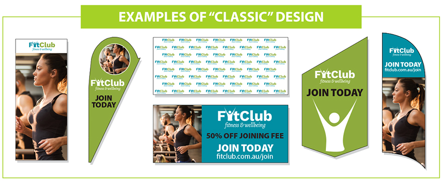
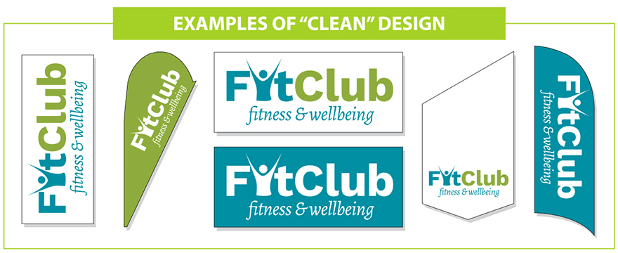
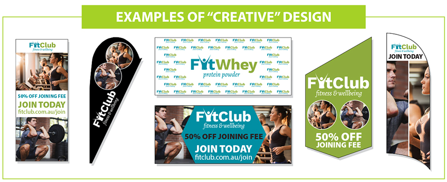
1. DESIGN - EACH ELEMENT IS A ‘VOICE’
|
Think of each design element on your banner as a voice. More voices and louder those voices are, the more likely your message will get lost in the noise. Make sure each of these voices sing in harmony, by keeping them in proportion, and limiting your palette to just three colours and two fonts will help maintain this harmony.
Please consider also that adding too much text on a banner is never a good idea (for ideal text sizes see below).
When you set out to create your outdoor banner, keep your prime objective in mind. If your prime objective is to drive customers to your website, make sure that the loudest voice goes to your URL.
One more thing, if you are designing your banner on an A4-sized page remember that for a 3metre x 1metre banner that you only need to use one-third the height of your page (in portrait mode) or just over half in landscape mode.
|
|
2. IDEAL TEXT SIZES
|
It’s important to consider at what distances that your viewers will observe your banner. A banner designed to be viewed by pedestrians at street height will have a viewing distance of less than 20 metres, whereas a banner placed on a motorway footbridge will have an average viewer distance of over 80 metres.
The table below indicates the correct type sizes (not font sizes as these vary from typeface to typeface) and will guarantee that you get your message across.
|
| Text height in centimetres | Best viewing distance in metres | Max readable distance in metres |
|---|
| Text height of 10cms | Best viewing distance 15m | Max readable distance = 40m |
| Text height of 20cms | Best viewing distance 30m | Max readable distance = 80m |
| Text height of 30cms | Best viewing distance 45m | Max readable distance = 100m |
|
|
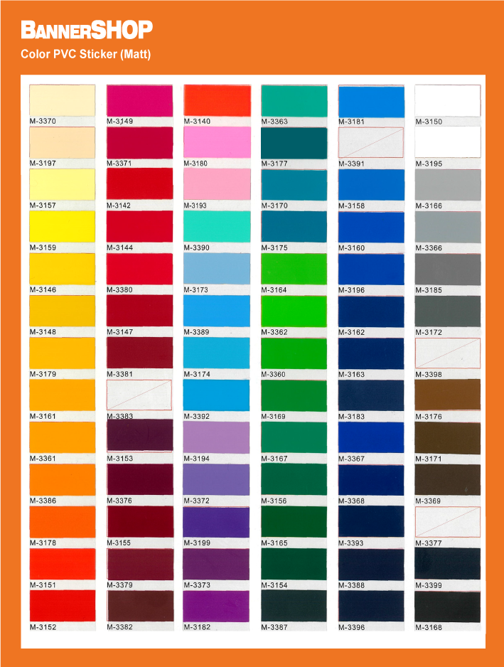
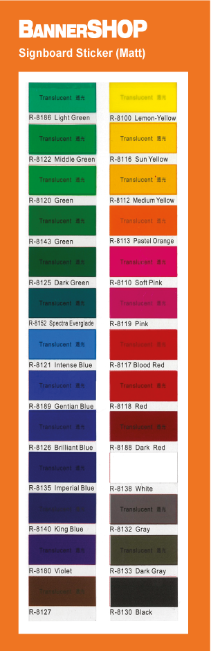
3. COLOURS AND COLOUR REPRODUCTION
|
|
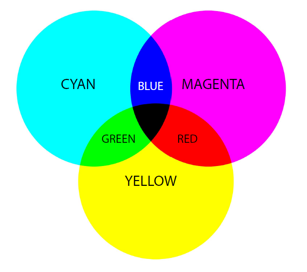
Have you ever experienced seeing a colour on screen that came out differently on the printed job? This is because display devices (e.g. monitors) are RGB devices, whereas printers are CMYK devices. So, just because a colour can be displayed on a monitor, doesn’t mean that it can be printed the way it was displayed.
|
|
|
The way around this issue is to save your files in CMYK (4 colour) mode as this represents the colour space of output devices. This will help maintain the consistency and quality through-out the reproduction process.
|
|
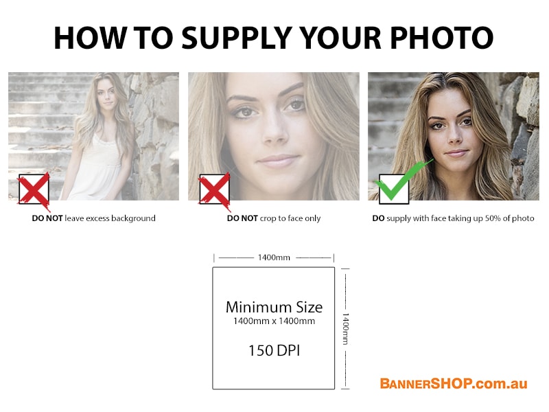
4. IMAGES AND RESOLUTION
|
|
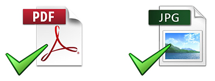
The best quality outputs come when the resolution of the file is 150 pixels-per-inch (PPI or DPI) or higher, at 1:1. By 1:1 we mean that for a 3metre x 1metre banner, the file by 3meteres x 1metre at 150PPI. We also recommend that you use either a high-resolution JPEG or PDF, in CMYK mode.
|
|
|
5. TEMPLATES TO HELP CREATING AN OUTDOOR BANNER
|
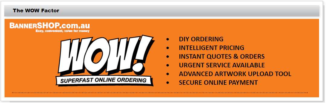
BannerSHOP offers a range of templates for standard outdoor banner sizes, as well as promotional flag sizes and shapes, etc.
Just visit www.bannershop.com.au for free downloads.
If you need further help with creating your outdoor banner, BannerSHOP provide a range of services to make the process of creating a banner easy. These services include:
Artwork layout set up - Logo, Text & Colour
Artwork amendments to suit product templates
Layout Review & Proofs
At BannerSHOP, we only use the best quality printers on the market and operate under the strictest of quality-control conditions.
Just remember when you are creating your banner - ‘get the message out there!’
|
|
|